Is Your Kiosk Going Unnoticed? Here’s How to Boost Engagement

07/13/18
Do people walk past your touchscreen kiosk without stopping? Or check it out briefly without lingering? If so, this post is for you. I’ll share with you the best approach for getting noticed.
Just because you put a touchscreen kiosk out in public doesn’t mean people will flock to it or interact with it for any length of time. These days, we’re all pretty savvy and jaded about technology and don’t necessarily relish seeing more of it. That’s not great news if you’re trying to attract attention for your business via touchscreen.
So how do you best use a touchscreen kiosk to support your business? By offering an experience that is worth your customer’s time. Oh, and by making sure that experience doesn’t inadvertently turn them off.
Here’s how to do that.
Take a Holistic Approach
Paying attention to all the parts of a user experience can make the difference between low and high engagement. Consider the user experience in its entirety, including value to the user; screen size and shape; and placement of the kiosk. And don’t forget to examine the design and touch-worthiness of your content.
That may seem a little overwhelming, so here’s how to get started.
Plan Your Strategy
Start by having a clear strategy that defines the value you are offering to the user. Is it faster check-in or check-out? Quick access to tourist information about local amenities? An entertaining product pitch directed at commuters waiting for a subway train?
It’s one thing if you must use a kiosk — when you need an ATM you’ll use one no matter how awful it is. But, if using a kiosk is optional, say for bag check-in at an airport while there are still humans available at a nearby counter, you'll likely take the route of least pain. If your kiosk is terrible nobody will voluntarily use it. The takeaway: if using your kiosk is optional, you have to give people a good reason to interact.
Consider the Environment
Be sure to think about where and how your kiosk will be used. Location, size and shape of the device all impact how users feel about a kiosk. If your kiosk is in an inviting, comfortable-to-approach space it will get more engagement than one in a slightly awkward-to-approach place. Makes sense, right? It turns out kiosk users heed social cues related to approaching and touching devices. For instance, if standing at a kiosk obstructs a busy flow of pedestrians, people are not inclined to give it a try. If it's in a no-traffic zone, engagement also suffers.
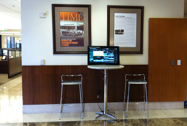
Low traffic = low engagement.
Appealing shapes and sizes of devices can also pique a user’s curiosity and draw them in while an unappealing device shape could cause them to keep their distance. And of course, you will want it to be evident in some way that it is a touchscreen rather than just a monitor.
If you’ve done well on these fronts, you’ve compelled a user to step up to your device, ready to interact. Now what?
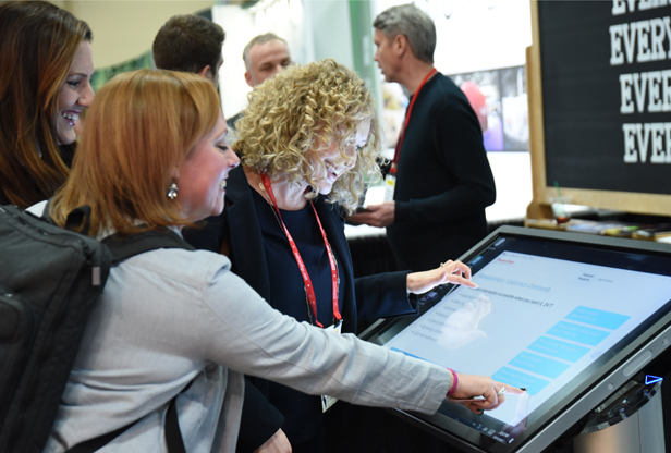
Interaction Design Matters
As you probably know from your own experience, touch interaction can be tedious or enjoyable depending on how it’s designed. This is where quality interaction design really matters. Make sure your design team understands and appreciates the difference between designing for mouse interaction and designing for touch.
Touch components require more feedback than mouse components. Preferred gestures are different with touch than with mouse interaction. Where clicking is preferred with a mouse, swiping is preferred with touch. Large gestures are easier and more fun with touch, while small, hard-to-hit targets, so common with mouse interaction, are tedious with touch. Well-designed touch interaction makes a huge impact on a user’s length of engagement with a kiosk.
Putting It All Together
A seemingly good idea for a kiosk can fall flat if even one component — content, location, hardware size and shape, and presentation design — is off. Here’s what I mean. A touchscreen video jukebox (menu of links to videos) to entertain consumers sitting in a waiting room while their cars are serviced sounds like a winning idea. But I’ve seen this “good idea” fail. Badly. How? The kiosk was located too close to chairs where others were sitting. The interaction was not touch-friendly enough — too much tapping was required — and the videos were too long and boring.
The typical engagement with this could-have-been-great kiosk was: tap to see a video, watch for 15 seconds, exit that video. Repeat those steps a couple more times then walk away. Total time of interaction: usually around 1 minute and 15 seconds. Most customers chose to be on their phones or stare off into space rather than interact with the kiosk. Ouch!
A well-designed and well-situated kiosk makes all the difference.
So what’s the lesson? When designing an interactive touch kiosk consider the whole user experience, from spotting the kiosk across the room to considering whether to approach it to deciding whether to interact with it, to the actual interaction on the screen. And, of course don’t skimp on great content to make your brand memorable.